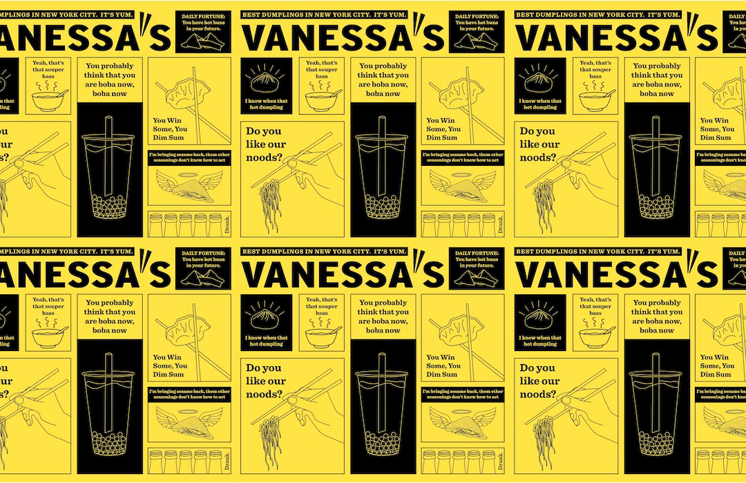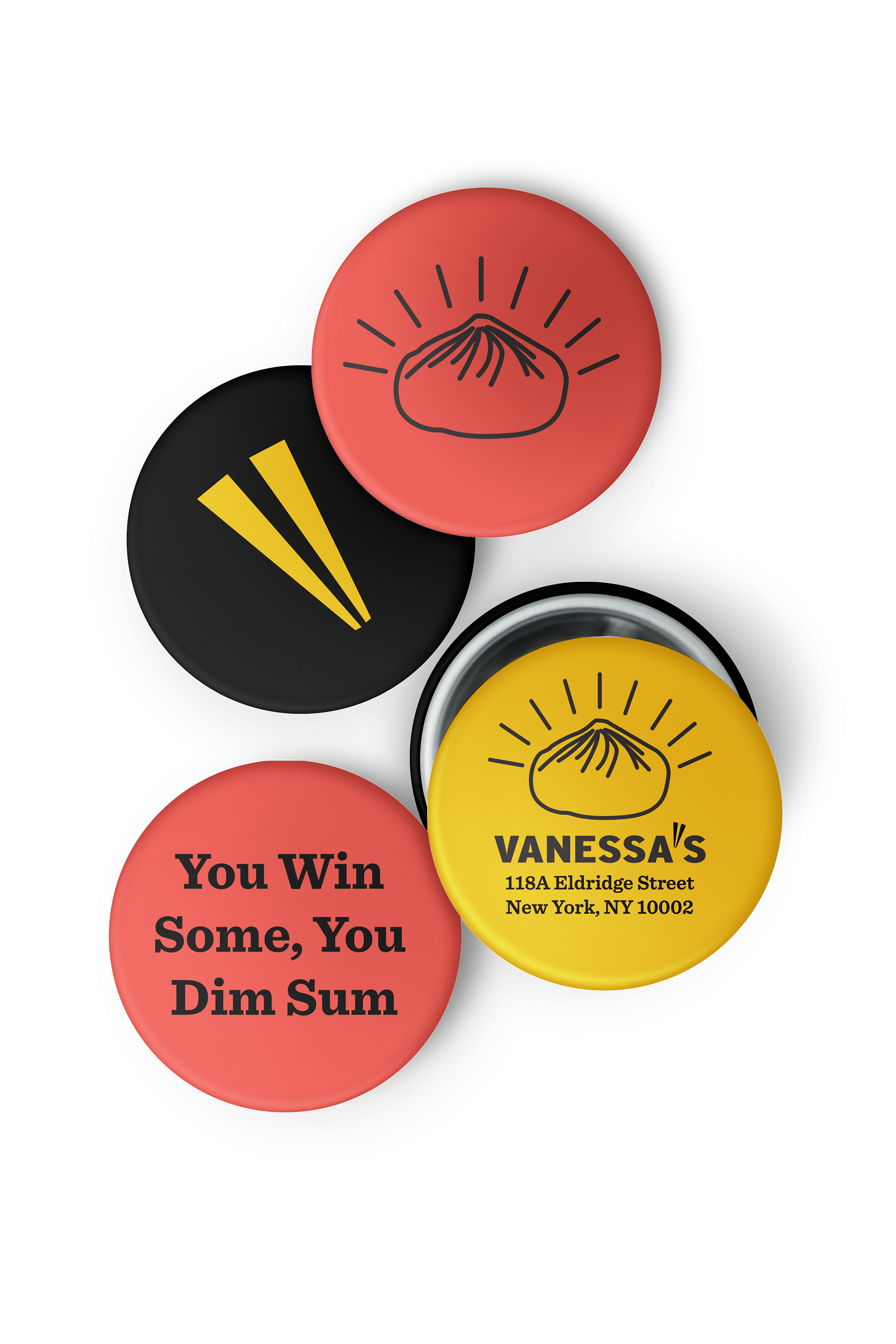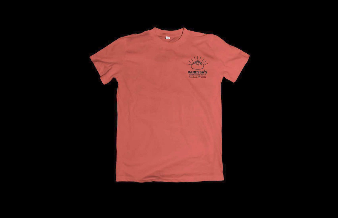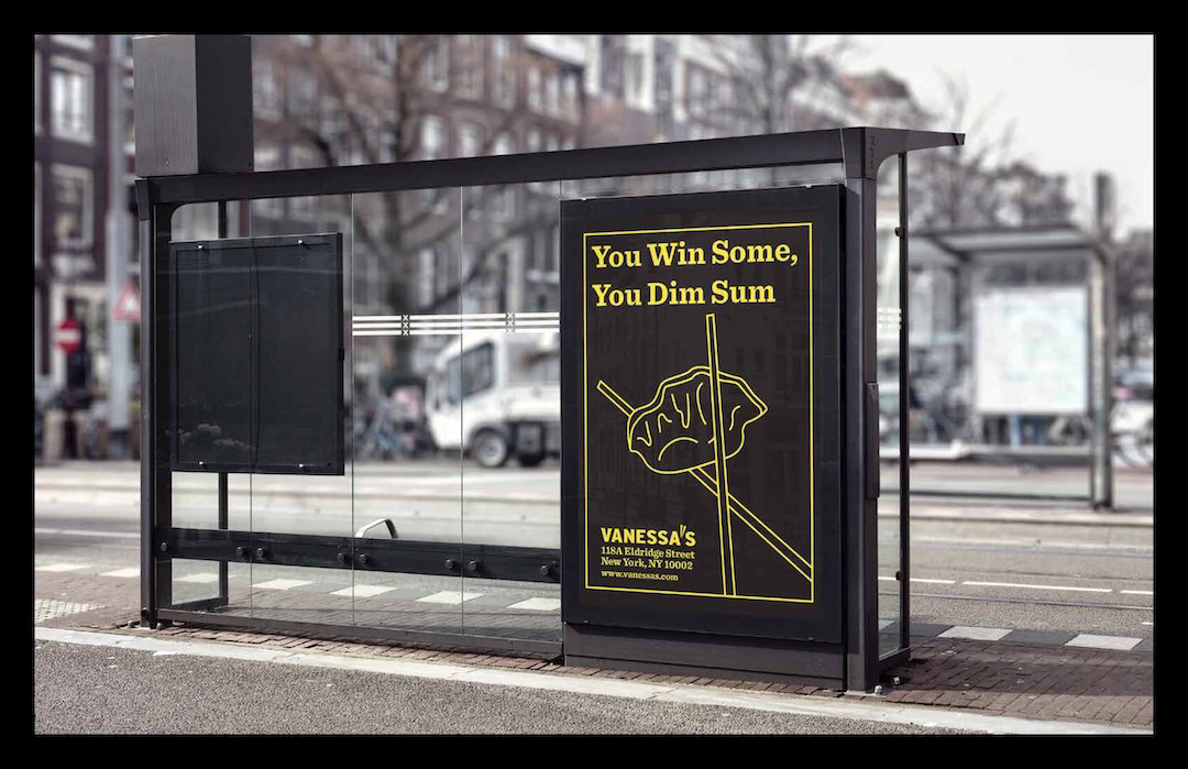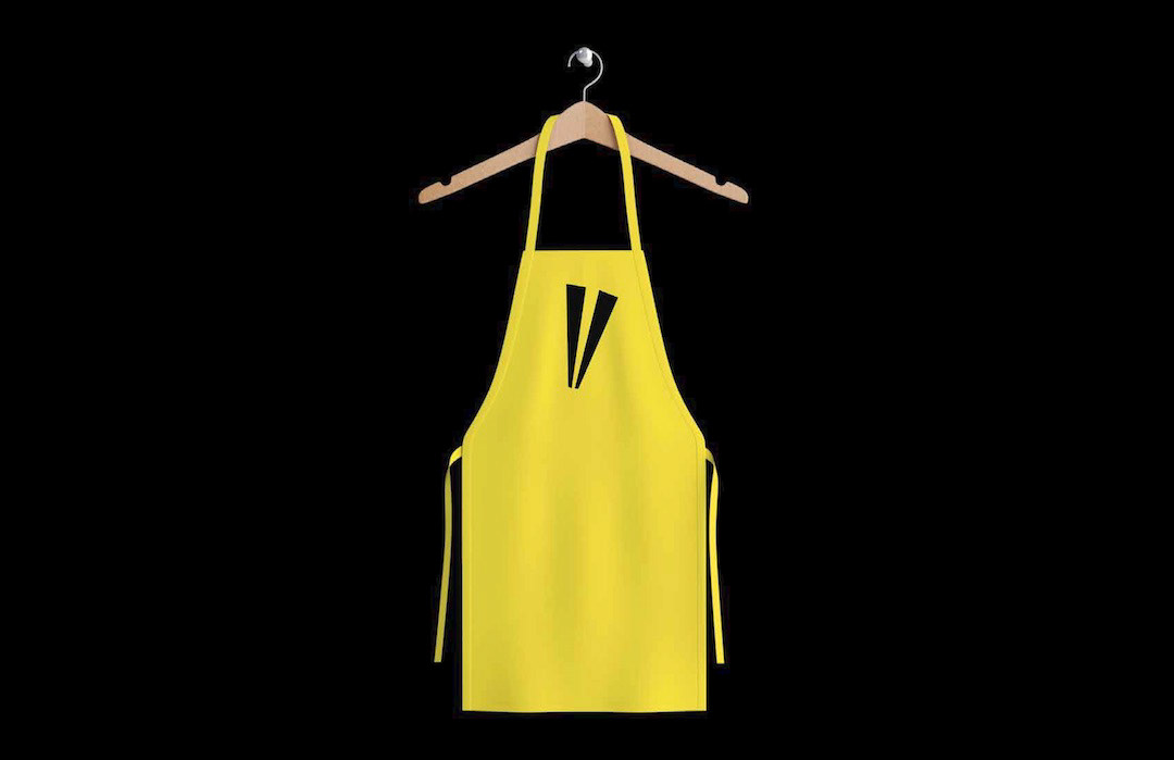
I played around with different ways to show the logo; in a word mark, icon or both. Once I sketched out ideas I knew I wanted go with the chopstick like icon and a bold sans serif logo.

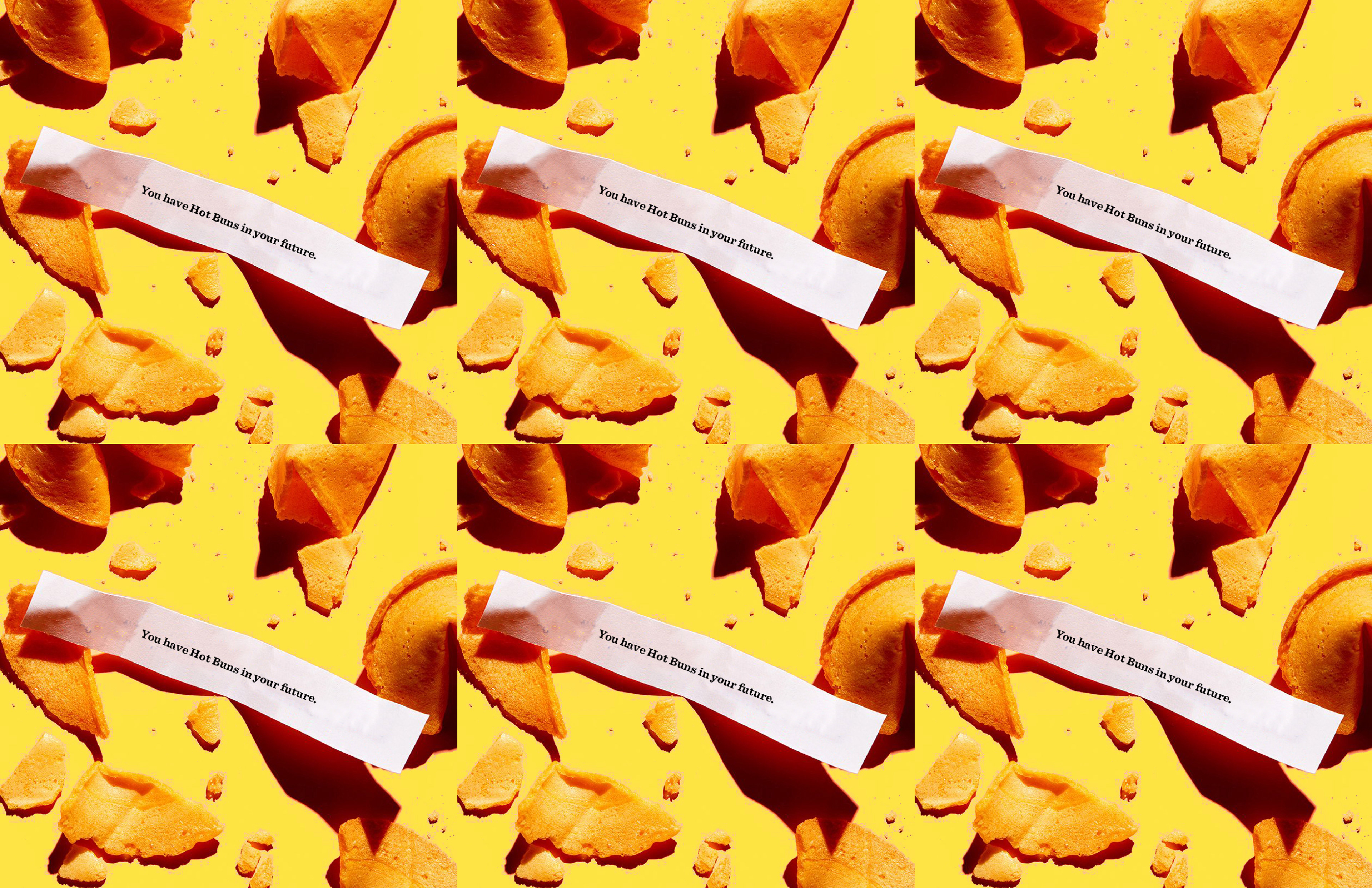
The illustrations are all paired with puns and some play on song lyrics about the menu items. It was fun to explore copywriting and create imagery that matched. Maybe you too will have Hot Buns in your future?