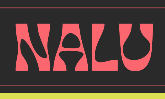
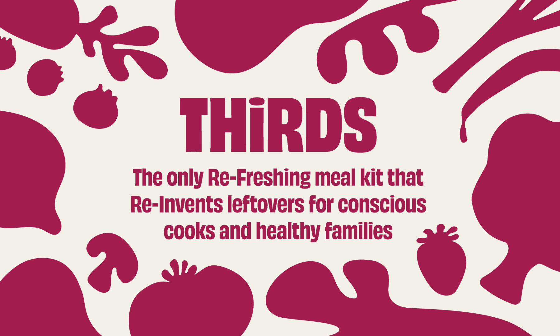
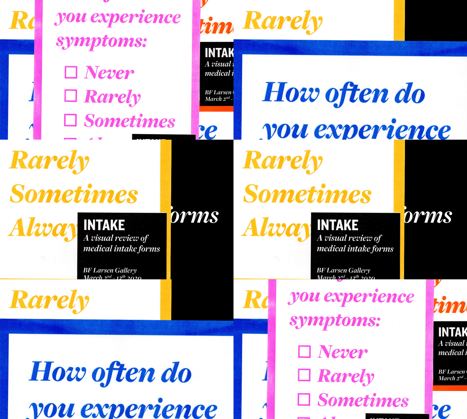
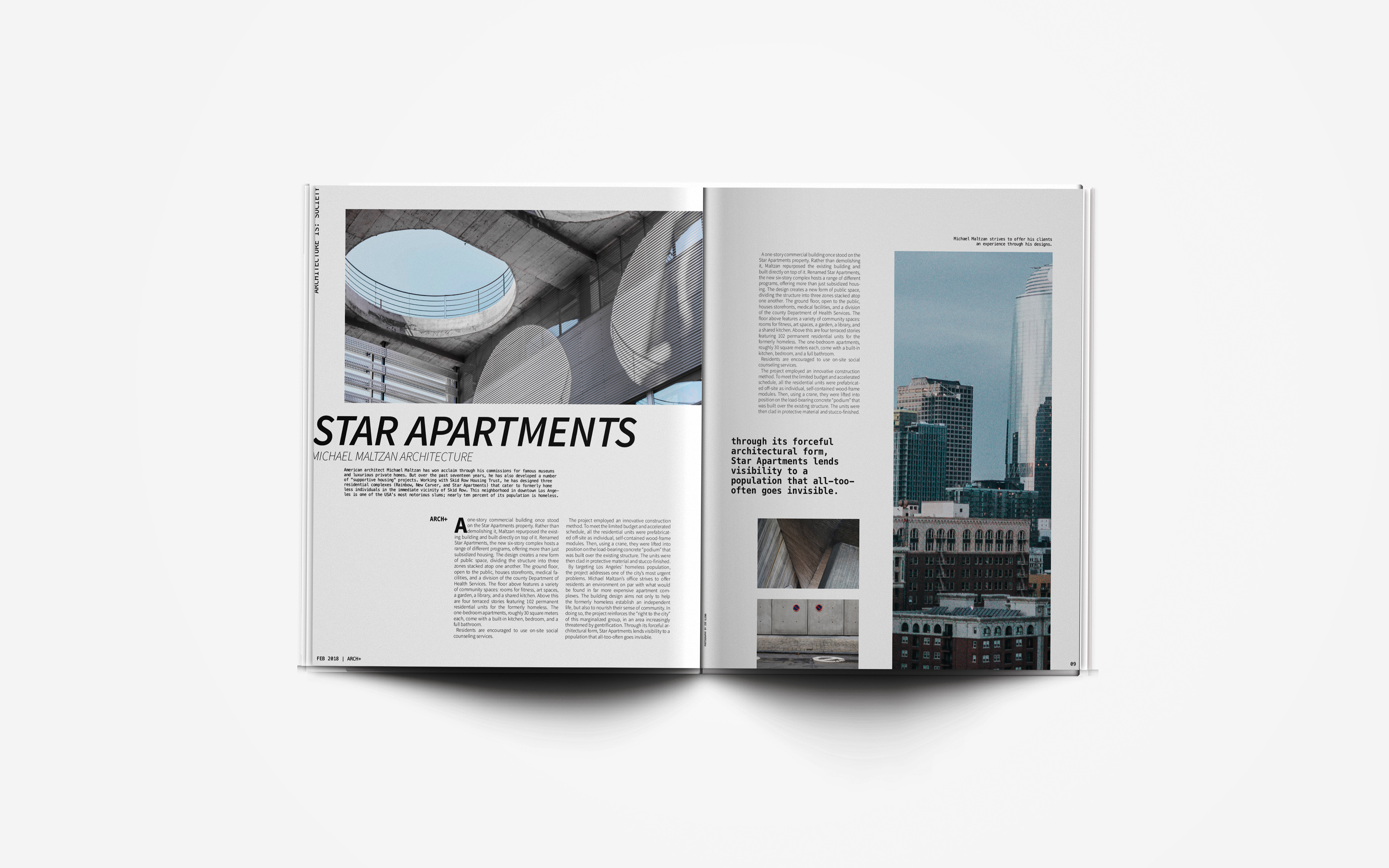
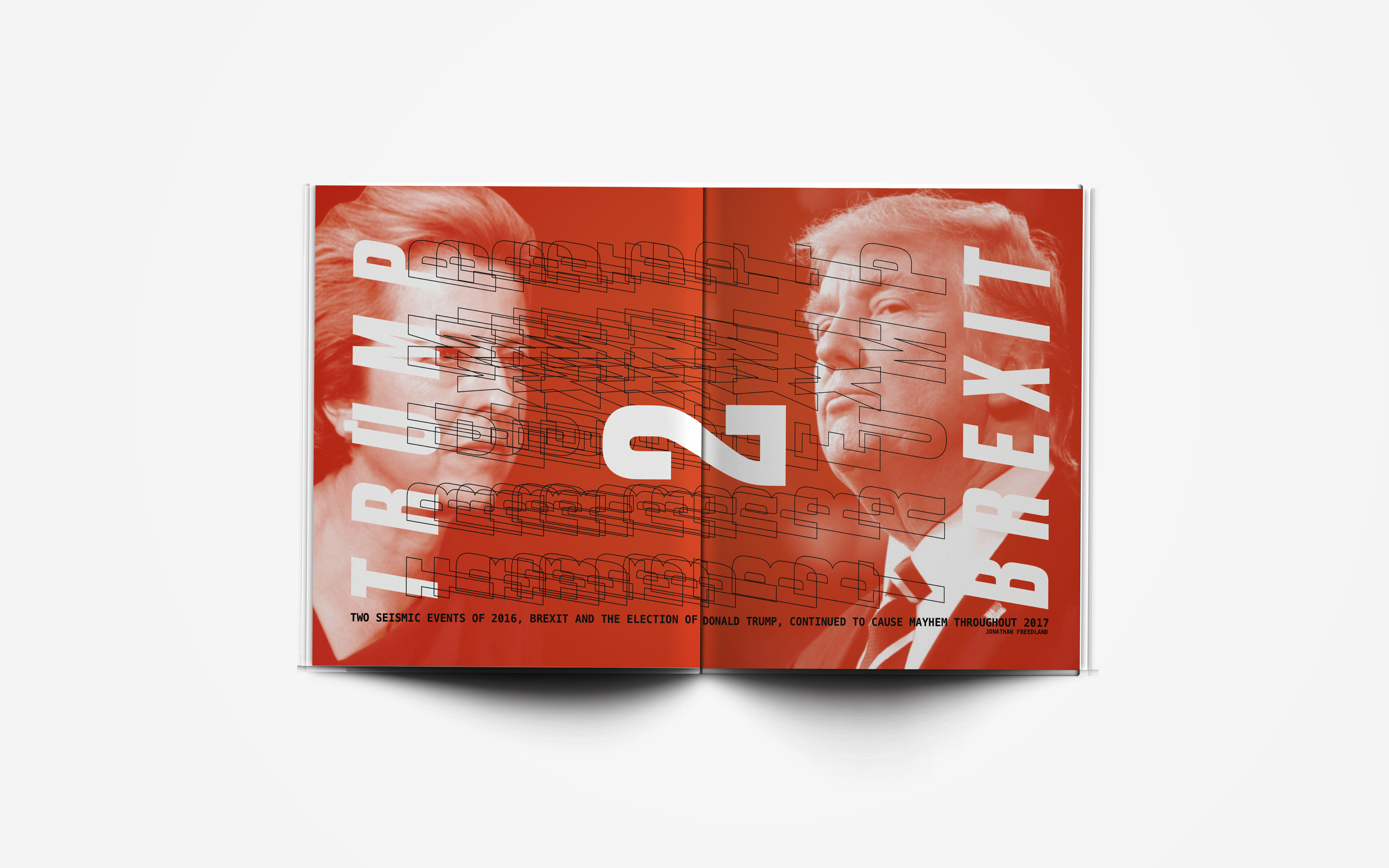
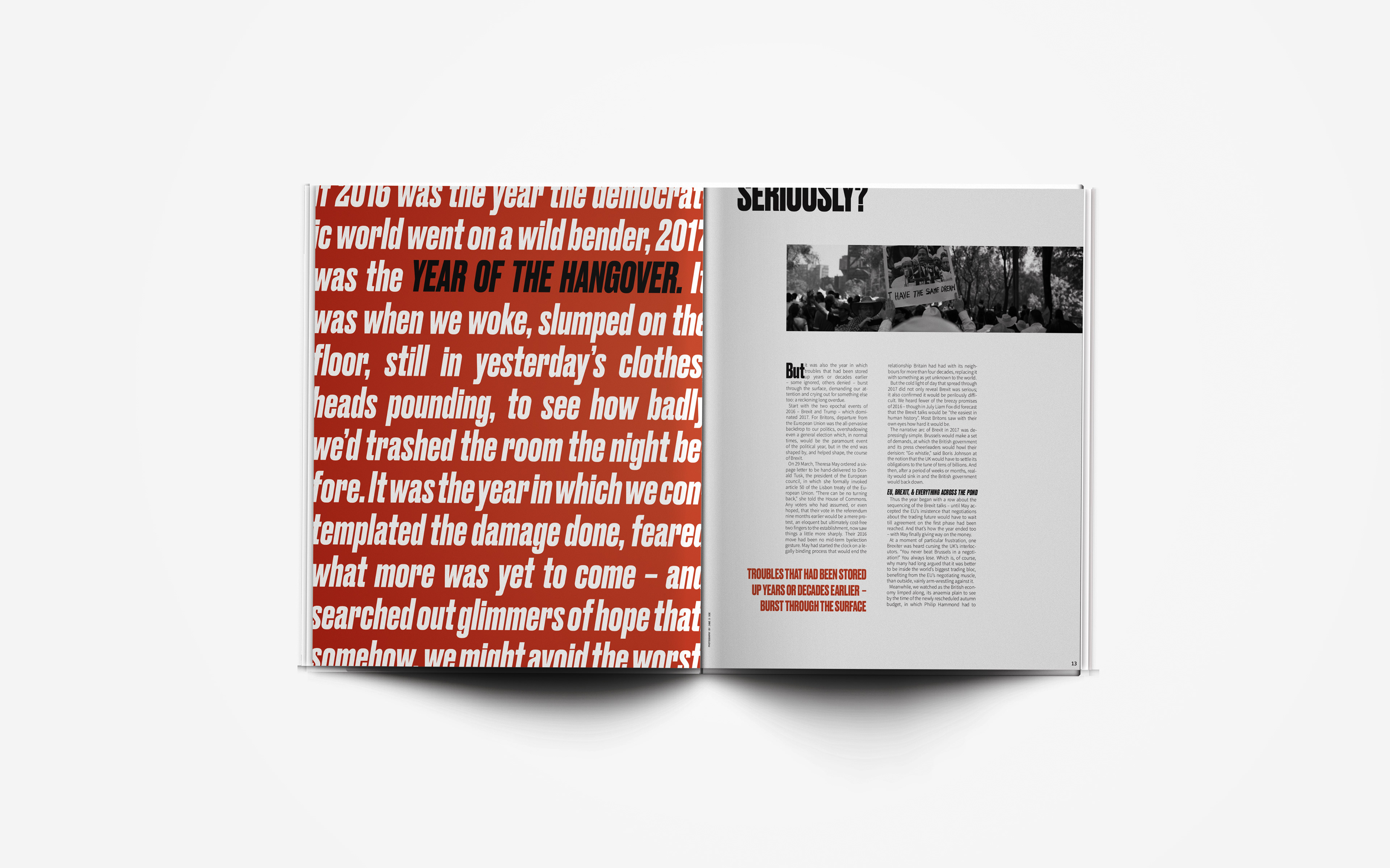
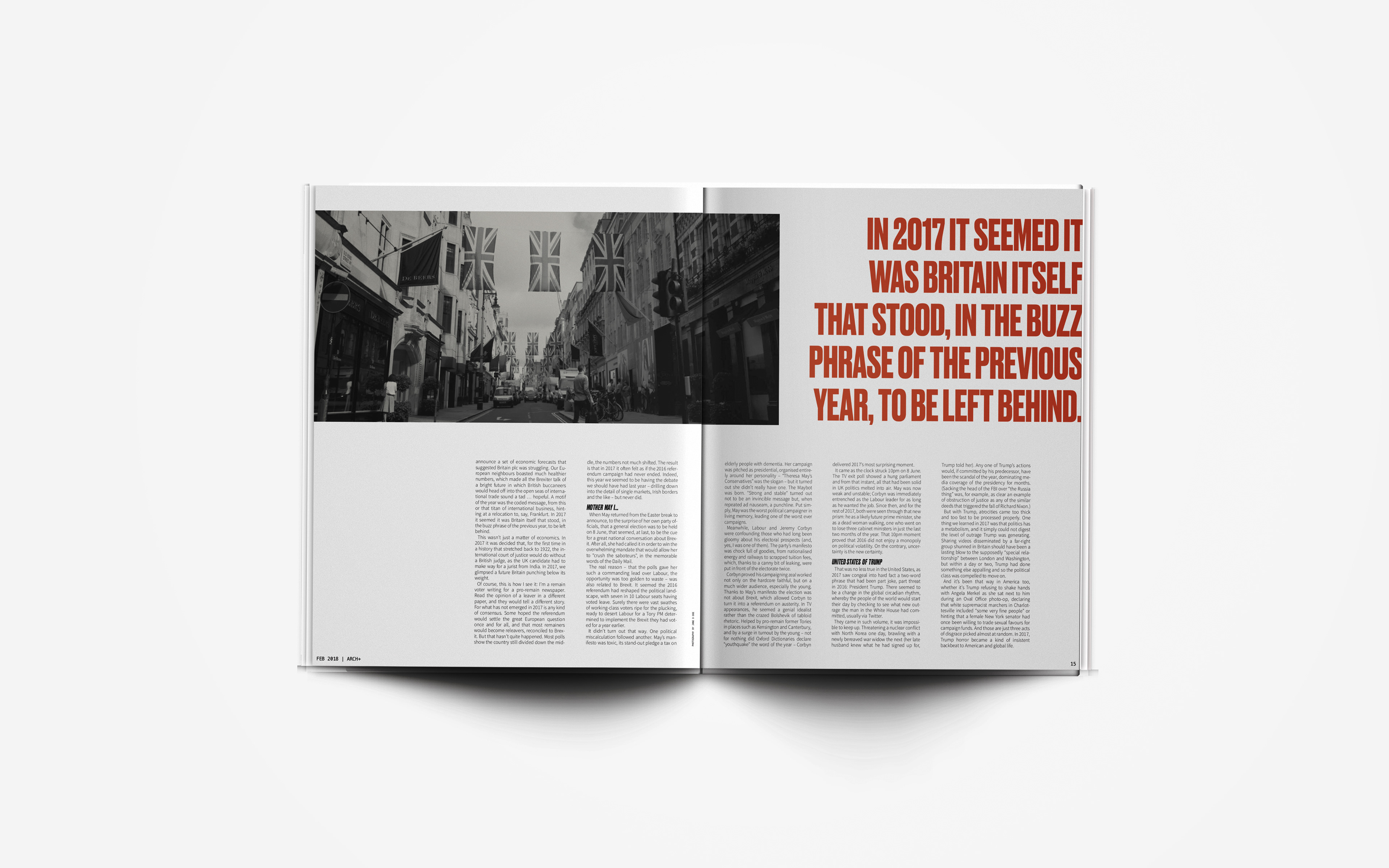
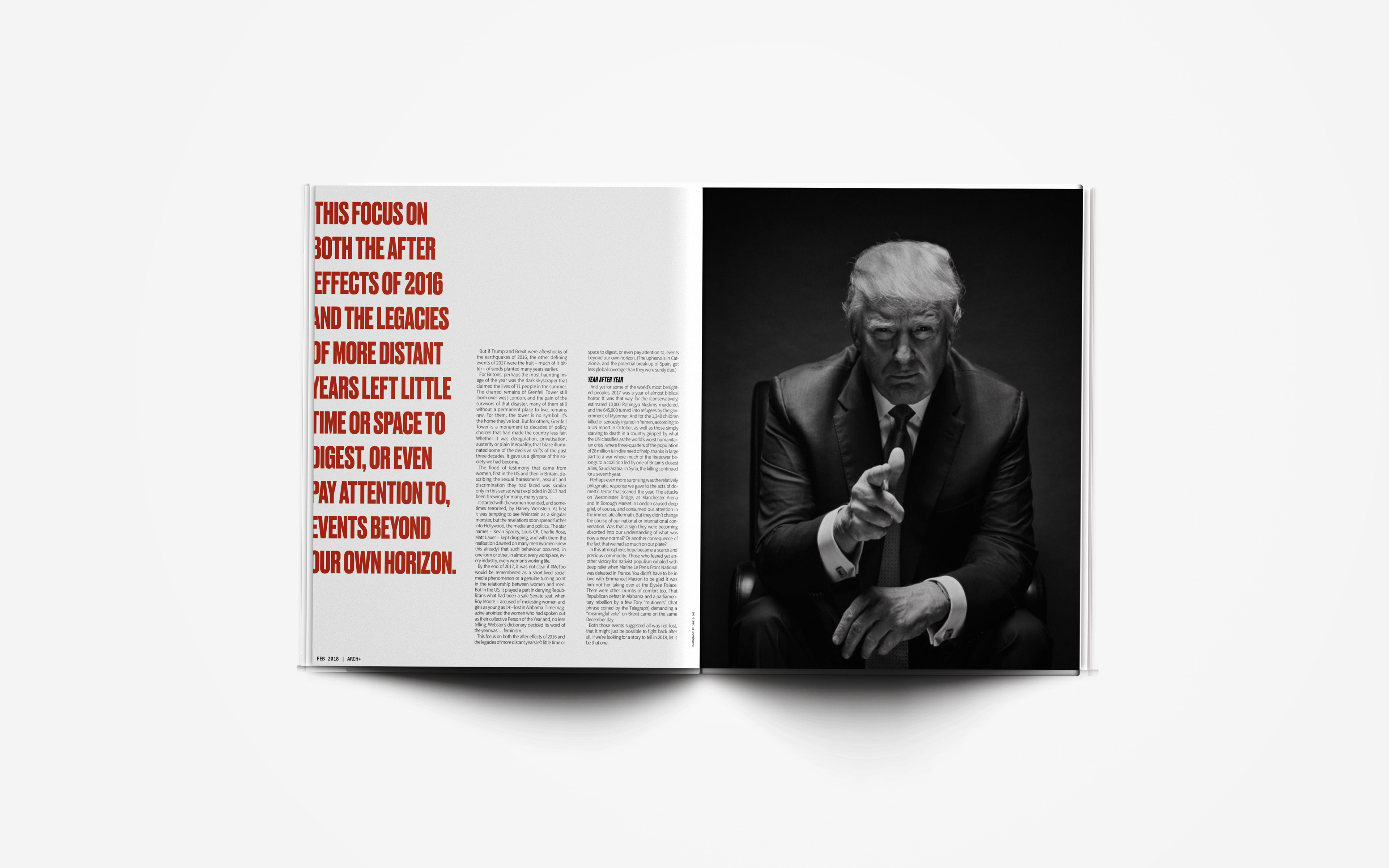
To capture this idea I used a limited color palette, a condensed headline typeface, and muted or monotone photography.
Instead of a formal masthead I chose to use the sketched + to portray the brand without taking away from the cover imagery. I then used a 12x12 grid to design my layouts spread by spread to allow for greater flexibility.
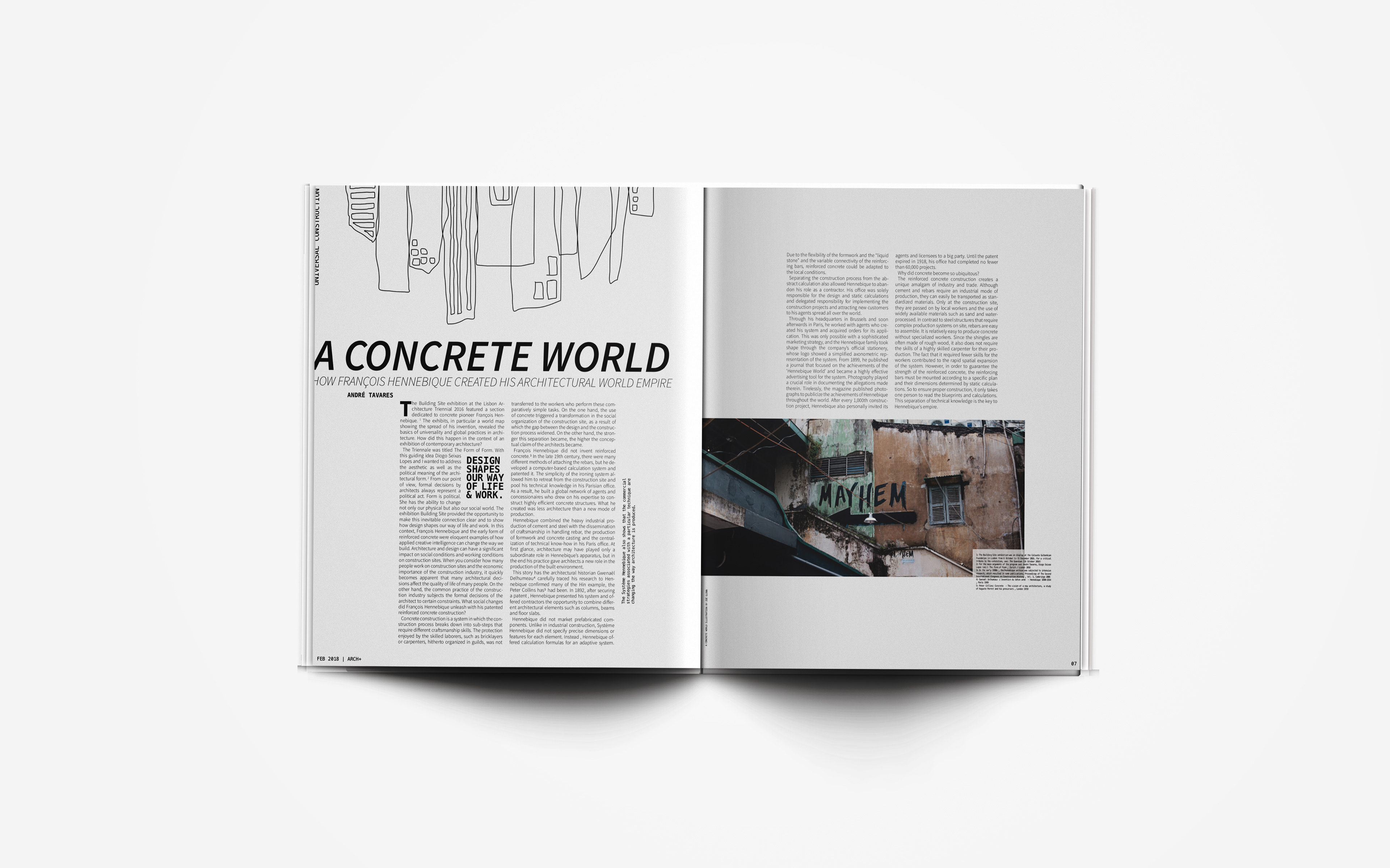
NOTE: This magazine redesign was created for a University assignment and is not related the actual magazine, ARCH+.

